March 28, 2019

Moodle Redesign Feedback Survey for PAIS: The Results

To follow up the work we did last year on improving the layout of our Moodle pages (based on student focus groups), we recently distributed a feedback survey to gauge the views of students now that they have had two full terms to work with the new layout. In this post we'll look at the results of that survey (full results of all responses are available as a download at the bottom of this article).

The survey was distributed to second-year undergraduate PAIS students in March 2019. Second year students were selected because (a) first-years would not have experienced the previous design as a point of comparison, and (b) there was a concern about 'over-surveying' finalists due to the NSS running at the same time. An entry into a prize draw for £50 Eating@Warwick credit was offered to anyone who took part. In total we had 36 responses out of approximately 200 students (~18% response rate).

How much do you agree with the following statements?

We started off by asking respondents to rate their level of agreement with the following statements (on a scale of strongly agree, agree, neutral, disagree, or strongly disagree):

  • 'My PAIS modules are now presented more consistently'
  • 'Structuring by weekly topics makes it easier to find what I'm looking for'
  • 'Reading lists embedded week-by-week makes it easier to find material'
  • 'It is now easier to find the contact details of teaching staff'
  • 'It is now easier to view my PAIS Moodle modules on a mobile phone'
  • 'The new Moodle layout is helpful for supporting my learning'

The results were as follows (click the graph to enlarge):

Results of the statement questions

Somewhat reassuringly, the vast majority of the responses were very positive, in particular around consistency, ease of finding content, and the decision to embed reading from Talis Aspire by week.

There is some slight area for improvement on the question about accessing Moodle on a mobile (this now works much better than previous years, but we acknowledge there are still some outstanding issues), and in particular there were a several respondents who only answered 'neutral' or 'disagree' when it came to the ease of finding staff contact details. We are going to look at improving this for the next academic year (2019-20).

For the next three questions we enabled text-entry answers to get some qualitative comments.

What is your favourite thing about the new layout?

The word cloud below shows the most common responses to this question. For the purposes of producing a meaningful word cloud, the totals of certain words were combined when they had near-identical meaning, e.g. 'consistent' and 'consistency'. (Click the image to enlarge):

Wordcloud of positive responses

We can see from this word cloud that one of the main changes we made (organising the modules by weekly topics, with weekly reading lists embedded in each week) was a very popular decision, as the words week, topics, reading, and lists featured prominently as respondent's favourite feature.

We can also see that references to consistent and standardised are very prominent, which was one of the main goals of our redesign.

There are many positive adjectives that show just how much students like the new layout. These include easier, quickly, accessible, convenient, concise, useful, logical, simple, and intuitive. Seeing these words coming back from our users is hugely encouraging as these are clear indications that we have got our design right in terms of usability.

What could still be improved?

Similarly, I have produced a word cloud based on what students said should be improved. (Click the image to enlarge):

Wordcloud of suggested improvements

The picture here was perhaps less clear, with no single theme around what wasn't working well (potentially this could be interpreted as a good thing, because there is no obvious area in which we are failing students). There were lots of different ideas to sort through, including encouraging use of forums, providing clearer contact details, improving weekly descriptions, and better use of the announcements section. Indeed, the need for clearer contact details was flagged up by quite a few respondents, and while we have made big improvements in consistency in this area since last year, it's helpful to know that we could still do better here.

Two major themes did appear to be visible, however.

Firstly, as we have now set an expectation of consistency across modules (particularly around Talis Aspire week-by-week reading lists) students are critical of modules that don't uphold this consistency. This is why we see words such as Talis, reading, list and week appearing prominently, because there were certain modules that didn't conform to the use of Talis or the weekly reading setup that students now expect to see.

Secondly, the way we handle assessment could be improved, both in terms of the consistency in assessment information that we provide in Moodle, and in terms of integration with Tabula which we use for submissions. This explains the prominence of the words assessment, essays, Tabula, and rubric.

Any other comments?

We ended the survey with an opportunity for students to leave any further comments in a free text field. Of those that left comments, most were positive about the redesign, with some additional recommendations for improving consistency, wider use of Talis Aspire, and improving the information about assessment.

The full list of 'any other comments' is shown below:


"Showing this to other students from the Faculty, universal positive feedback was received. This has been something the PolSoc SSLC has supported from the beginning of the year, pitching this idea to other departments in the Faculty (not necessarily saying they should use the PAIS design) would ensure that joint degree students have at least relatively similar degrees of consistency if not just one single moodle experience."

"Both sets of Moodle pages have been easy to use and useful overall."

"The collection of Resources and General Info is really useful for just having one common space of misc stuff!"

"Thank you for putting effort into developing these platforms."

"I think having a Tails Aspire page (one that is regularly updated, of course) should be a requirement for all modules."

"Clearer information on Exams/Essays would be better than the huge blocks of text under the 'assessment' section on the new Moodles."

"There could be some more consistency between modules in the way they use moodle - in terms of the notes and seminar information they put up. Also, a general standard level for the amount of notes, and if not what is available on the lecture slides that is available. If someone misses a lecture due to illness, and it is not lecture captured, there needs to be notes on the lecture if there is very little on the slides (this is the case in my International Relations module)."

"A real improvement from last year!"


Conclusions and full results

Collecting this data was an extremely useful exercise, and we would like to thank all of the students who have now responded. We will be using the results to fine-tune some of the improvements to the modules, particularly around staff contact details, consistent use of reading lists, assessment information, and mobile responsiveness.

There were also many other helpful comments and suggestions that were submitted by individual students (unfortunately too many to respond to in this article) that we will be taking into account for the next academic year.

The winner of the prize draw has now been selected and has been informed directly.

You can download the full raw data from the survey here: pais-moodle-redesign-feedback-survey-march-2019-full-results.pdf.

Any queries about the survey or the PAIS Moodle redesign can be directed to James Roscoe, Academic Technologist for PAIS.


August 23, 2018

New Moodle layout for PAIS in 2018–19

Over Summer 2018 we decided to hold some Moodle focus groups with PAIS students to find out more about how they are currently using Moodle to support their learning. As part of this, we discussed a potential new course layout which would involve structuring the module page by weekly topics.

The new layout for PAIS in 2018-19
An example of the new PAIS module layout

This suggested layout was warmly received by the focus group participants, and is intended to provide three main benefits:

  • More consistency across PAIS modules.
  • A simpler, cleaner layout that works better on mobile devices.
  • An easier interface for not only finding content, but also editing and maintaining it.

The restructure proposal also received strong support from the PAIS Senior Management Team (SMT) and has been commended by the central Academic Technology team.

In particular, consistency in layout and presentation was highlighted by students as a major area for improvement. When asked to consider the statement 'My modules are presented in a consistent way', 0% of the participants agreed with the assertion, with 91% actively disagreeing. However, it was also recognised that tutors ought to have the creative freedom to deliver content how they see fit, within a given framework. Our aim is therefore to provide a consistent page template, within which colleagues can still create any resources they wish.

This article outlines the main changes that have been made, which can be summarised as follows:


Course pages are now structured by weekly topics

It made pedagodical sense for our Moodle pages to reflect the structure of the course itself, i.e. a 10- or 20- weekly schedule of topics. This has been achieved via the 'Collapsed topics' course format, i.e. a dropdown of sections, which provides easy access to the content without required much vertical scrolling. There is also a 'General Information & Resources' dropdown at the top for easy access to resources that might not fit into specific weeks, such as the module overview and assessment information, or any other resources that could be useful to refer to throughout the year.

The old grid layout
Previously: Organised by categories
New weekly layout
Now: Organised by weekly topics

Previously, course pages were organised by relatively arbitrary categories that were arranged in the grid format on the homepage, e.g. 'reading' / 'resources' / 'additional resources', with each module using slightly different variations. This made it more difficult for students to find what they were looking for, and sometimes the grid sections were simply being used to house a single link, requiring unnecessary extra clicks. The grid format also had a number of bugs associated with it, including issues around visibility settings and permissions, and was also difficult to use on mobile devices.

HTML tables have been removed, which were previously being used to present the course structure. These were exceptionally difficult to navigate on mobile phones, often requiring awkward horizontal scrolling. The new collapsed topics layout is much easier to view on mobile, which is important as our research found that students are accessing Moodle on a multitude of different devices.

The dropdown structure now effectively takes the place of the old weekly schedule tables, except that now we have the ability to add Moodle activities/resources directly into weekly topics (rather than just having to edit the section summaries), which will have great improvement our ability to quickly add content, move and edit existing material, and also access learning analytics data for individual resources.

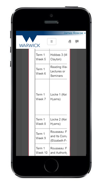
The old layout on a phone
Previously: Accessing table-based resources in the narrow popouts was difficult on a phone
New phone layout
Now: Students simply tap the weekly dropdown

Students also expressed a strong preference for using Talis Aspire to present reading list material rather than static lists within Moodle. For those using Talis Aspire, the link is still available via the block in the right-hand column, though in the future we also hope to make use of an incoming Talis Aspire plugin that will enable us to embed weekly reading from Aspire into the correspondingly weekly dropdown on Moodle, which will make it quicker and easier to access the current week's reading.

Teaching staff contact details are now presented in a standardised format

The ability to easily access the course director's contact details and feedback hours was a feature that all students wanted. Students also commented that it would be helpful to see the contact details for seminar tutors.

The vast majority of modules were already displaying basic contact information for the director, such as name and email address, though we noticed that several of the email links were not working due to errors that had been introduced when adding the 'mailto' links.

Given that all modules ought to have this information as standard, we decided to implement a more consistent way of displaying this, and have now placed contact information for the module director and additional teaching staff in the right-hand blocks. This now includes additional details as standard, such as a photo, link to staff profile, and an office number that ties in with the interactive campus map. Placing this information in the side column now frees up space in the main section for course-related content.

Teaching staff information
Some example contact details

To view the contact details, users simply click on the lecturer's name to open the dropdown. (Note: On some older browsers, e.g. Internet Explorer, the show/hide dropdown functionaility may not be supported, in which case all the contact details are displayed by default).

All courses now have a standard header template

All module pages were using an image in the top-left, but the size/dimensions of the image (and therefore the way in which content flowed around it) was inconsistent. Again, there were problems associated with viewing on mobile devices.

We have decided to standardise the presentation of the header by including a PAIS-themed header image which incorporates the module image via a circular cut-out. The header uses red shades from the official PAIS colour palette and displays the module title and code. It has also been set to always span 100% of the available width of the page, meaning we no longer have isues with text wrapping, and it displays well across all screen sizes.

The new header image
An example of the new header image

This new header provides a more consistent look and feel, which is both asthetically pleasing and provides a clear visual indiciation to students of which module they are currently accessing. Anyone who wishes to change the photo shown in the circular cut-out can do so by contacting James Roscoe.

A PAIS resources block has been added

Lots of the existing module pages had links to standard departmental references, such as the PAIS website, marking critieria, the UG/PG handbooks, and Intranet sites. For instance, last year a link to the new marking criteria had to be manually added to all PAIS module pages, which was took a reasonable amount of time.

We've now decided to offer a standard set of 'department-level' resources on all PAIS Moodle pages, which has been rolled out automatically via a department-wide side-block. This is now much easier to update (e.g. should we ever need to add/remove/edit any of the links) as it can be changed in one place rather than needing to edit every single module manually.

PAIS resources block
The new PAIS Resources block

If there are additional PAIS web links that you wish to add into the main body of your module page, then this is of course still possible.


We hope that you will find the new Moodle layout an intuitive and flexible way to deliver your module's online content. While it is always a little daunting to adjust to a new system, we are confident that after a little getting used to it we will all find the new format easier to edit and maintain, and that these changes will give students a much better experience using Moodle to support their learning.

If you have any comments, questions, or simply want a refresher on using Moodle, don't hestitate to get in touch our Academic Technologist, James Roscoe.


Our thanks goes out to Kostadina Yanakieva and Alex Paszta-Keene, our temporary members of staff who helped with much of the legwork for reformatting the 80+ modules across the PAIS department.


March 14, 2018

Latest News block on Moodle

The Moodle 'Announcements' forum is a good way to send out updates to your students, as not only do all enrolled students receive an email notification but the post is also retained in the forum for future reference.

In this post, we'll explore how you can use the 'Latest News' block in Moodle to add a feed of the 5 most recent announcements to the sidebar of your module page.

This is particularly useful if you want to increase the visibility of your module announcements. We all know that email tends to be rather ephemeral, and it's unlikely that even the most diligent of students will click into the announcements forum every time they visit your module page.

Therefore, adding a feed of announcements as a side block is a good way to ensure that important updates will always be seen by students when they log in - A handy feature if you regularly have important news, events, or deadlines to remind students about!

For a quick reminder of what the Announcements forum actually is, and how it differs from a discussion forum activity, take a quick look at my other recent post on Announcements vs Discussion Forums.

The announcements forum

Adding the Latest News block

Firstly, you will need to 'Turn editing on' for the page via the cog in the far top-right of the module page. This will allow you to add content.

Next, at the bottom of the left-hand navigation menu, choose 'Add a block', as highlighted in red below. If you can't see the left-hand navigation menu, you may need to toggle it on by clicking the menu icon in the top-left of Moodle (also highlighted below).

Open menu and add block

You will then be presented with a list of possible blocks to add to your page. In this list, select 'Latest news (News forum)', as highlighted below.

Adding the latest news block

You will now see the 'Latest News' block appearing in the right-hand column of your module page, with the announcements already populated, as shown below. It's as easy as that!

The latest news block

How the Latest News block works

Every time that you add another item in the announcements forum, this will appear in the side block, with the most recent appearing first. This will display up to 5 of the most recent entries.

Each entry title acts as a hyperlink that takes students straight to the post in question. In addition, you will notice that just above the title, the author and date/time posted is also displayed.

As a teacher on the course, you will also see the 'Add a new topic...' link at the top, which is a quick way to add a new post to the announcements forum.

To give students an easy way to view older posts, there is also an 'Older topics...' link at the bottom, which allows anyone to view the entire list of announcements, as shown below.

All announcements

Any questions?

I hope you have found it useful to learn how to add the 'Latest News' block to your page, and perhaps this is something you may consider providing if you regularly make use of the announcements forum.

If you have any queries or would like further support on your module page, please feel free to contact me.


March 09, 2018

Table of Contents block on Moodle

If your Moodle page is particularly long and involves a lot of vertical scrolling, you may find it useful to add a 'Table of Contents' block to the sidebar of your module. This is really quick and easy to set up, and works particularly well for modules which have a lot of content on the landing page, such as those using the 'Topics' course format. It allows students to simply click on a menu at the top of the page which will take them straight to the section they want to view.

A quick disclaimer: For courses using the 'Collapsed Topics' format, you may find this tip less useful given that the collapsed sections essentially already act as a table of contents. The same can also be said for courses using the 'Grid' format, and in fact on the grid format the 'Table of Contents' block doesn't currently seem to open up the sections properly (at least not on our Warwick's Moodle site).

Adding the Table of Contents block

Firstly, you will need to 'Turn editing on' for the page via the cog in the far top-right of the module page. This will allow you to add content.

Next, at the bottom of the left-hand navigation menu, choose 'Add a block', as highlighted in red below. If you can't see the left-hand navigation menu, you may need to toggle it on by clicking the menu icon in the top-left of Moodle (also highlighted below).

Open menu and add block

You will then be presented with a list of possible blocks to add to your page. In this list, select 'Course Contents', as highlighted below.

Add course contents

You will now see the 'Table of Contents' block appearing in the right-hand column of your module page, with the list of sections already populated, as shown below.

Course contents block added

You can also now move, show/hide, or configure the block. It's the 'configure' option (via the cog drop-down) that we'll look at next, which can be selected via the cog dropdown.

Configure button for table of contents

Configuring the Table of Contents block

On the configure screen, there are a few options available underneath 'Block settings' which I will briefly explain.

Configure contents block

  • Block title - This overwrites the title of the block if you would rather it say something other than 'Table of Contents'.

  • Enumerate section titles - This option is on by default and places a number in a small grey box next to each menu item, as can be seen in the screenshots from earlier.

  • Auto title - Instead of lifting the text of each menu item from the section title, it will instead lift it from the section summary (If you are not sure what a section summary is, have a quick look at my other post on 'Using Moodle Labels'). This is probably not advisable if you are using particularly long section summaries, but if they are very short and work better in the menu than the default section title then this could work for you. Note that this option only works if you are using the 'default section name' for each section. If you have specified your own title for a section rather than using the default ('Topic 1', etc) then your own title will still take precedence over the section summary.

Any questions?

I hope you have found it useful to learn how to add the 'Table of Contents' block to your page, and perhaps this is something you may consider providing to help students navigate your course if your Moodle page is particularly long.

If you have any queries or would like further support on your module page, please feel free to contact me.


March 01, 2018

Announcements vs Discussion Forums

Moodle forums are a fantastic way to encourage additional discussion and student participation outside of face-to-face sessions. They provide opportunities for tutors to communicate with their students outside of class, to explore issues in more detail than time might allow in a seminar, and can even be used for assignments in-between lectures.

However, it's important to understand the difference between an Announcements forum, and a more generic discussion forum (forum activity). The key difference is that only teachers can post in the Announcements forum, whereas anyone on the module can post in other forums.

Another key distinction is that students automatically receive email notifications of items posted in the Announcements forum, therefore making it a good place to post important news that you need students to know about (but not necessarily comment on).

The screenshot below shows an 'Announcements' forum alongside a generic forum (which has been titled 'Discussion forum'). Despite behaving differently, they look rather similar!

announcements-alongside-discussion.png


Adding an Announcements forum

Firstly, everything discussed in this post should be done in editing mode on your module page. Therefore, we first need to 'Turn editing on' for the module (via the cog in the far top-right of the page).

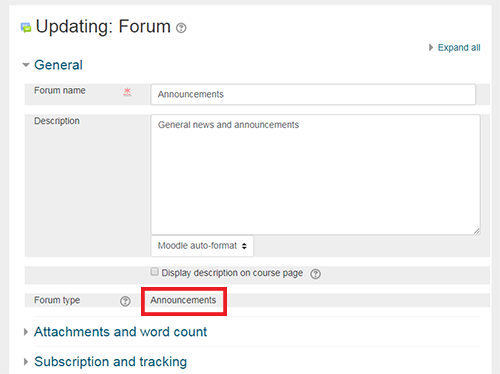
You should find that an Announcements forum is automatically present near the top of your module page. It's possible that at some point it may have been renamed to something other than 'Announcements', so to check whether or not it is an Announcements forum you can choose 'Edit > Settings' next to the forum and then look to see if 'Announcements' is set as the 'Forum type' property (as shown below). If it shows something else, then the forum is not an Announcements forum.

Announcements property

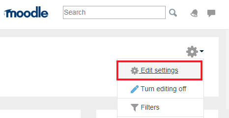
If you don't seem to have an announcements forum, you can reinstate it by simply going to 'Edit settings' for the module (via the top-right cog) and then click 'Save and display' to reset the Announcements forum.

Edit settings

Remember, the Announcements forum can't be posted in by students, so while they are useful for delivering important news, you cannot encourage students to post/reply directly underneath an item because their permissions won't allow them to do so.

Add a general discussion forum

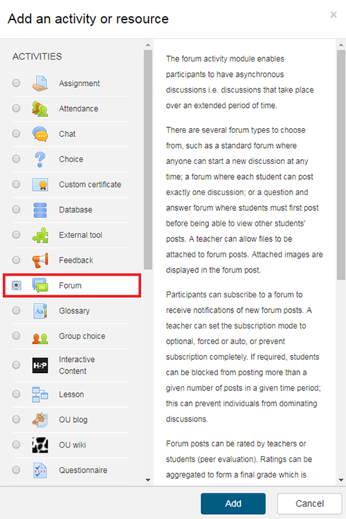
To add a general discussion forum (that students can post in), click on 'Add an activity or resource' for the section you wish to add the forum into, and then choose 'Forum' from the list of options.

Add a forum

You can then input settings such as the forum title before adding it into your module page. You can even add multiple generic forums to your page, for example if you wish to have one per section.

General advice

Both types of forums behave like any other Moodle resource in that you can show/hide, move, delete, and edit them at any time.

Given that Announcements and the more generic forums appear very similar visually (with exactly the same icon) it's worth using titles and/or descriptions that clearly explain how they are to be used.

Any questions?

I hope this post has helped you understand the difference between the Announcements forum and the more generic discussion forum.

If you have any queries or would like further support on your module page, please feel free to contact me.


February 20, 2018

Using Moodle labels to signpost content

How do you add instructions, descriptions, and signposts on your Moodle page, when you need to explain something to students?

Many of our pages are currently using the 'section summaries' to deliver this content (or indeed using section summaries for all of the module's content).

In this post we'll explore why 'labels' are a more powerful and flexible way to achieve signposting in Moodle.

Wait, what's a section summary?

A section summary is the piece of content that appears directly beneath the section title. They are generally used for briefly introducing the section before the main content. Here's the official description of a section summary from the Moodle.org documentation pages:

This is a default label which allows you to place information about the specific topic or week. It could be an introduction to the unit of study or a short summary of the weekly plan. Activities and resources are listed below this section.

Because the information you add to the summary appears as a label, it should be very short so that the course page doesn't become too long. If you find yourself wanting to say more than a sentence or two then consider adding a resource to this topic instead (for example, the first activity might be a page called About This Topic).

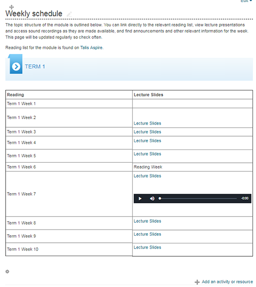
Note the emphasis on making the section summary short! Take a look at this screenshot below which shows an example where the section summary is much longer than it needs to be:

Section summary

In this example, the section summary for 'Weekly schedule' contains a paragraph, a link to a Talis Aspire reading list, a subheading, a table, a list of weeks, links to lecture slides, and even an audio recording. On the face of things this works fine, but arguably it far exceeds the intended scope for a Moodle section summary.

Why are section summaries problematic?

For one thing, the whole section can only be edited in one go by clicking on the 'cog' icon at the bottom-left of the summary. As a result it can also only be moved/hidden/duplicated/exported/deleted in one go, which signficantly restricts how flexibile your module content is, for example should you ever wish to restructure your page or add new content.

Secondly, we completely lose the ability to access learning analytics for the content contained withing a section summary. We have no idea how many students are clicking on the Talis Aspire link, downloading the lecture slides, or listening to the audio recording. This is valuable information that can be used to assess and improve our modules.

Why use labels instead?

Breaking down our section into bite-sized pieces of distinct content means that our course becomes more modular/granular, and as a result we have better control over our content on a resource-by-resource basis.

Our advice would be to restrict your 'section summary' to just that - A brief 'summary' of the content that is about to follow. You can then place your content (lectures, downloads, links, video, podcasts, etc) as individual resources underneath the summary, and signpost this content using labels.

Simply put, labels are short pieces of descriptive content (usually text) that are constructed in just the same way as section summaries, except they act as standalone resources and can therefore be moved around the page or positioned in between resource to provide further clarity or explanation.

Adding a label

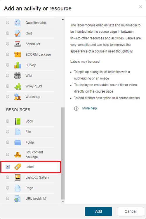
You can add a label to your page by using the 'Add an activity or resource' link and then selecting 'label' from the list of options, as shown below.

Selecting a label resource to insert

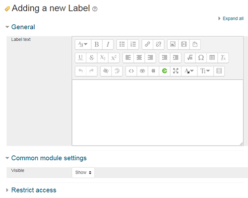
You will then be presented with a simple editing interface for inserting the content of the label. Similar to the 'section summary' editor, this contains options for headings, formatting, links, images, and media - Though in most cases we would use a label for simple text content.

We also have options here to change the 'visibility' of an individual label, or to set access restrictions (such as by student, seminar group, date, or course progress). This is a great way to make individual pieces of text or descriptive content conditional on certain prerequisites, something which is not feasible with section summaries.

Editing a label

An example of using labels for signposting

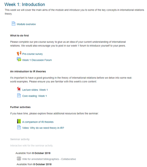
Below is a good example of how we might break up our content into individual resources and use labels to help signpost these resources. What is your inital impression when you see this content? Hopefully you will find the layout clear and easy to see how the week's content is broken up.

Example of labels

In this example, the 'section summary' is simply used for a single sentence to briefly explain what will be covered in the week. The module overview is then contained within a sub-page to reduce the amount of content shown in the section summary. After all, students probably don't need to read the module overview every time they access the course!

We then use a label ('What to do first') to point students towards some initial activities to help ease them into the module (a pre-course survey and a discussion forum), before inserting another label 'An introduction to IR theories' which sets out expectations for the week's core content.

Another label is then used to direct students to the 'optional' resources (a Moodle book and a video link), showing that labels are a great way to separate out compulsory and optional content (or provide further clarification as to the relevance of each piece of content).

We then have a greyed-out label ('Seminar activity') which is followed by a collabative wiki. Notice how these have both been set to release from 8th October, which shows how we can use conditional access settings to control visibility of content (including labels) based on factors like date, student ID, or seminar grouping.

And the best thing from the point of view of the teacher, is that all these resources and labels can be individually moved, edited, and hidden, because they have been added as individual pieces of content rather than as one whole section summary. It's now also incredibly simple to insert additional resources at any point in the course.

We can also access learning analytics for all the individual resources in this section, enabling us to measure the students' engagement with the core material, optional resources, collaborative wiki, etc. This gives us a valuable insight into the ways students are interacting with our content.

This is just one example of how labels might be used to provide better signposting, structuring, and clarification on your module page. There are many more use cases out there - the possibilities really are endless.

Any questions?

I hope this post will help you see the potential benefits of using labels for structuring your Moodle page.

If you have any queries or would like further support on your module page, please feel free to contact me.


February 14, 2018

Adding RSS feeds in Moodle

As it's currently reading week at Warwick, why not use this opportunity to add some useful reading links to your Moodle page via the power of RSS feeds!
What is an RSS feed?

RSS feeds are a great way to provide your students with links to the latest content from external blogs, news, and other websites that may be of relevance to your module. It provides a constantly up-to-date list of the latest posts and articles from a chosen source, and is a really nice way to keep your page current and relevant without having to manually add new content.
So what does 'RSS' stand for? Well, there's actually some debate about that, but most people believe it stands for 'Really Simple Syndication'. Let's have a look at just how simple it is to set up...

Finding an RSS feed
First, establish the website that you want to draw content from. You'll then need to check that the site has its own RSS feed, so look out for a link or button with words 'RSS' and/or 'Feed', and in particular keep an eye out for the RSS icon, often shown in orange as below.

RSS icon

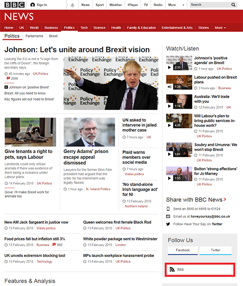
For this example, I'm going to use the BBC's Politics news feed and show how this can be embedded into Moodle. In this screenshot below, taken from the BBC Politics landing page, you can see the RSS feed icon that I've highlighted in the bottom-right. This one is quite small and not actually shown in orange (which demonstrates they can be a little tricky to spot at first), but nevertheless the feed is there.

BBC Politics website

On clicking that link you will usually be presented with the raw output of the latest posts, but it's not what we see on this page that's important but rather the link to the feed itself.

You'll need to copy the link to the RSS feed, either by right-clicking the link and choosing 'Copy link address' (or similar, depending on your browser), OR you can click on the link and then lift the URL from your browser's address bar, as pictured below. In this case, the URL is 'http://feeds.bbci.co.uk/news/politics/rss.xml', so this is what we need to copy to our clipboard.

BBC politics feed URL

Adding the RSS feed block

Firstly, you will need to 'Turn editing on' for the page via the cog in the far top-right of the module page. This will allow you to add content.

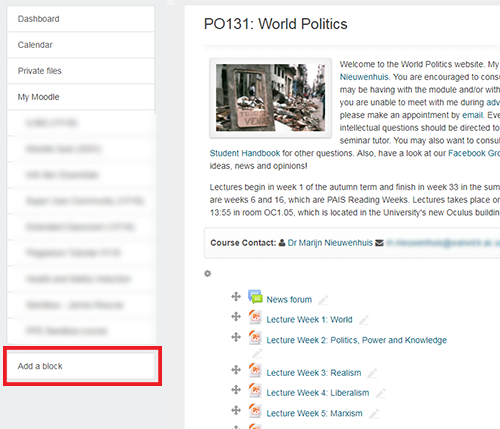
Next, at the bottom of the left-hand navigation menu, choose 'Add a block', as highlighted in red below. If you can't see the left-hand navigation menu, you may need to toggle it on by clicking the menu icon in the top-left of Moodle (also highlighted below).

Open menu and add block

You will then be presented with a list of possible blocks to add to your page. In this list, select 'Remote RSS feeds', as highlighted below.

RSS feed block in list

You will now see the (empty) 'Remote RSS feed' block appearing in the right-hand column of your module page, which you can now move, show/hide, or configure. It's the 'configure' option (via the cog drop-down) that we need to use to set up our feed.

Empty RSS feed block

Configuring an RSS feed

On the configure screen, you will see a number of options. You will also notice that there is a list shown of existing feeds that other colleagues have already added and made 'public' (feel free to make use of these if they look useful!).

To add your own feed (in this case the BBC Politics feed that we grabbed earlier) we need to click on the 'Add/edit feeds' link'.

Configure RSS feeds

Depending on your level of permissions, the next screen might show you some pre-existing feeds, or it might not. Either way, click on the 'Add a new feed' button at the bottom.

This will then take you to the next screen for adding a new feed, as shown below.

Add a new feed

You will need to paste in the RSS link that you copied earlier into the top box (Feed URL), and then you can choose to give it a custom title if you wish.

Naming it is optional, as the feed should generate its own title. In the case of this feed, the BBC actually provides an automatic title of 'BBC News - UK Politics', which is probably good enough. But, for some feeds you may wish to provide your own title for clarification, or perhaps just to shorten it. In the example above, I've decided to rename it 'BBC Politics'.

You also have the option to set it as a 'Shared feed'. This means that other colleagues at the University will be able to see it in the main list of existing feeds, but depending on their permissions they may be able to edit/delete it too! For this reason, I'd advise keeping this set to 'No', unless you have a good reason to do otherwise.

Click 'Add a new feed', which saves the feed and takes you back to the 'Manage all my feeds' page.

You now need to go back to the module landing page - the quickest way to do this is to click your module title in the 'breadcrumb trail' of links along the top. Then (as before) use the cog drop-down on the RSS side block and re-enter the configuration settings. You will then see your feed listed in the 'Choose the feeds...' list, which you can now select!

Select BBC Politics RSS

There are a few other options available on this screen which I will briefly explain:

  • Display each link's description - If the RSS feed supports it, you will get a brief description underneath the title/link to each resource.

  • Max number of entries to show per block - Pretty much what it says, but perhaps this should best be thought of as 'Max number of entries to show per feed' (see next point).

  • Choose the feeds... - As discussed, select your feed here. You can even select multiple feeds (by shift+clicking or ctrl+clicking), and then each feed will display the number of posts selected above - So in theory selecting 2 feeds with a max number of 5 would result in 10 posts in total on your block.

  • Title- If you want to rename the title of the block. If you leave this blank, you will get the title of the feed itself as the name of the block, which may be fine. I would definitely recommend inserting your own title if you are selecting multiple feeds, otherwise the block title will lift it from the first feed (which is a tad confusing).

  • Show a link to the original site - You will get a link saying 'Source site...' at the bottom of the block which will take you to the website of the feed provider (can be useful if you want to encourage students to read more articles, but note that this only works for the first feed if you select multiple feeds.

  • Show channel image if available - You may get an image/logo from the publisher at the top of the block, but not the words 'if available'... Some publishers don't provide them!

Due to the discrepancies discussed above in relation to 'number of entries' and 'title', I would tend to recommend only selecting one feed per block. Using multiple feeds per block can create some confusion, and you will be probably find the interface is cleaner and easier to manage if you simply add another block to your Moodle page and insert the second feed that way (if you actually want multiple feeds).

Hit 'Save changes' and you can then return to your module landing page and see the newly added feed on the right-hand side, as shown below (which may vary in appearance depending on the options you selected above).

BBC Feed added

And that's all you need to do! It may take you a few minutes to add/configure the feed, but once done you won't have to touch it again and you can benefit from a continuously updating list of news stories that will publish as links to your page whenever the publisher adds new content.

It's a great way to help make your module page feel fresh, current, and up-to-date, and also gives students more variety in terms of the range of sources that you direct them to read. We're already seeing some great uses of RSS feeds around the departments of PAIS, Philosophy, and Sociology at Warwick, so next time you're reading a relevant blog or website, do look out for the 'RSS Feed' icon and consider adding it to your Moodle page!

Any questions?

I hope this post will help you with adding RSS feeds to your Moodle page, and is something you may consider providing for students during reading week.

You can also find further support documentation over on moodle.org - Remote RSS feeds block.

If you have any queries or would like further support on your module page, please feel free to contact me.


February 07, 2018

Talis Aspire blocks in Moodle

Staff and students at Warwick can take advantage of the Talis Aspire reading lists to help organise and manage reading lists.

There are many advantages of using Aspire lists (compared to static reading lists), including better controls for integration with the library, the ability to link directly to resources, better sharing capabilities, features for tracking engagement, as well as ensuring a consistent approach across multiple modules.

It's also possible to automatically add a link in your Moodle module to the current year's reading list. In this post, we'll look at how to add and configure this feature on your Moodle page.

Adding the Talis Aspire side block

Firstly, you will need to 'Turn editing on' for the page via the cog in the far top-right of the module page. This will allow you to add content.

Next, at the bottom of the left-hand navigation menu, choose 'Add a block', as highlighted in red below. If you can't see the left-hand navigation menu, you may need to toggle it on by clicking the hamburger-style menu icon in the top-left of Moodle.

Add a block

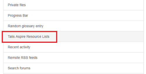
You will then be presented with a list of possible blocks to add to your page. In this list, select 'Talis Aspire Resource Lists', as highlighted below.

Add the Talis Aspire block

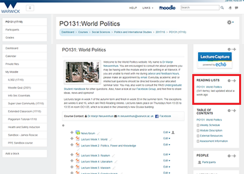
The block will then be visible on your page (as shown below), and providing the current year's list has been correctly linked to your module within Talis then it should automatically display a link to the list, along with the number of entries it contains and the date it was last modified. It really is as easy as that!

Module with Talis block

Configuring the block

There are a few options available to you once the block has been added. You will need to ensure you clicked 'Turn editing on' for the module in order to see these options (This will already be the case if you have just added it via the instructions above!).

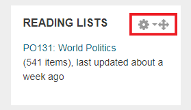
You can move the position of the block within the sidebar by dragging-and-dropping the 'arrows' icon shown below. You can also show/hide the block via the cog dropdown, and you can also use this dropdown to gain access to the 'Configure' settings for the block.

Reading list block options

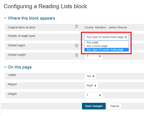
Within the 'configure' settings, there are a few different options - But the one I would draw your attention to is the 'Display on page types' dropdown. This gives you three options to choose from, which determines where the block will be visible for students:

  • Any page
  • Any course page
  • Any type of course main page

The difference between these options may be a tad confusing at first, as they rely on a complicated combination of page types, page contexts, sub-pages, and permissions. There's a more detailed discussion around this over on the Moodle.org forums, but as a general rule of thumb: For Warwick's Moodle site, you should choose 'Any type of course main page' if you just want the block to appear on the module's landing page, or alternatively choose 'Any page' if you want it to appear both on the landing page AND any sub-pages.

These visibility options also apply to other Moodle blocks (such as the Echo 360 block) so it's worth knowing they are there. If in doubt, I'd stick with the default (usually 'Any type of course main page') as this is what most modules will be using.

Display on page types

Any questions?

I hope this post will help you with setting up your Talis Aspire reading block on your Moodle module page.

If you have any queries or would like further support on your module page, please feel free to contact me.


January 29, 2018

Adding mailto links in Moodle

As a course convenor, it's good practice to include your contact details in the opening section of your Moodle module, including your email address. To make things easier for your students to contact you, you can also create a clickable link (called a 'mailto' link) that instantly fires up an email to the convenor in the student's preferred email client.

This is a really simple tip that adds a nice usability boost to your Moodle page, but it has to be done in quite a specific way.

Adding a mailto link

Most module pages already have a space set up where the convenor's details are displayed, similar to the example below, so we'll skip over setting this up and jump straight to adding the mailto link.

No mailto set

In this example, the course convenor's name is a link that directs students to their staff profile on the web. This is indicated visually by the colour blue. The email address is currently visible, and students can manually highlight+copy+paste it into an email client, but it's not been set up as a link.

To edit the content and add the link, we first need to 'Turn editing on' for the module (via the cog in the far top-right of the page). Next, click on the smaller cog icon which will have now appeared at the bottom of the section (as shown above). You will find this right at the bottom of your opening section, which may not necessarily be immediately below the contact details, so you might need to scroll down to find it.

On the next screen, highlight the email address in the summary section editor, and click the 'link' button on the top-row of the toolbar as indicated in red below. You may also wish to 'copy' your email address to the clipboard (Ctrl+C / Cmd+ C) before clicking the link icon.

Link button

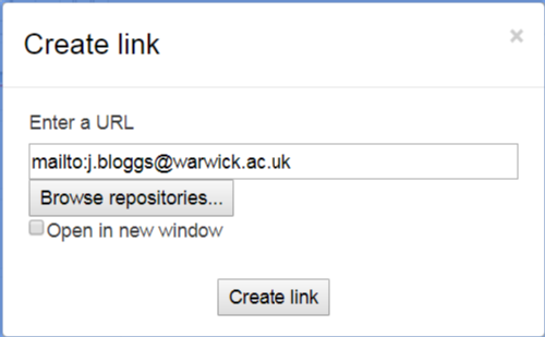
In the pop-up box that appears, you will now need to type 'mailto:' followed by your email address (which you can paste with Ctrl+V / Cmd+V if you copied it in the previous step).

This means the text box should read something like mailto:j.bloggs@warwick.ac.uk. Note that the 'mailto:' part needs to be added exactly as shown below, i.e. all one word and with a colon, but no space, before the email address.

Add mailto link

Now hit the 'Create link' button to add the mailto link, and then at the bottom of the page hit the 'save changes' button.

Checking the link works

Back on your module page, you will find the email address has now been visually styled as a link, and if you hover over it most browsers will indicate the destination of the link in the bottom-left corner of the window, as can be seen below.

Hovering over mailto

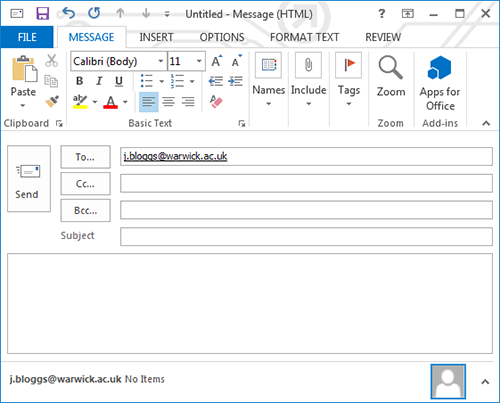
Clicking on this link will now launch our email client of choice, open up a new email, and populate the 'to' field automatically with the email address. The default email client for many people (if they are running Microsoft Office) will be Outlook (as shown below) but it can be configured to anything the user wants.

Composing an email in Outlook

Common pitfalls

There are two major things to watch out for when contact details are concerned, and even if you think your email link has been added it's always worth checking for these:

Firstly, if the 'mailto:' text has not been added in front of the email address, the link will break. In the case of Warwick's Moodle, if we create the link as simply j.bloggs@warwick.ac.uk then Moodle will actually interpret this as a webpage link to https://moodle.warwick.ac.uk/course/j.bloggs@warwick.ac.uk. This will launch a new page with an error message!

Secondly, sometimes when a course convenor has changed on a module, the text of their email address may have been updated but the mailto link might not have been updated.

Take a close look at the example below. It looks like the link will send an email to Joe Bloggs, but hovering over the link reveals that the mailto link will cause the email to be sent to Jane Doe instead!

Wrong mailto link

If you have this issue, simply edit the section as discussed earlier, then change the link target, being sure to retain the 'mailto:' text in front of it.

Any questions?

I hope this post will help you with checking your module's contact details and ensuring your email links are working as intended.

If you have any queries or would like further support on your module page, please feel free to contact me.


January 23, 2018

How to check if your Moodle sections are visible to students

The ability to hide/show sections in Moodle in an instant is a powerful way to control access to your content. For example, you may wish to temporarily hide a future part of your module until it is ready for release.

Unfortunately, when using certain course formats in Moodle, it's not always obvious which sections you have visible or hidden to students. As a result, sometimes we can forget that we have actually hidden a section when we in fact need it to be visible.

This is particularly common in cases where you might have inherited a module from a previous convenor, so it's always worth checking that all the sections you intend to make available really are visible.

In this post, we are going to see how you can check that your module page looks as it should to your students.

Topics format

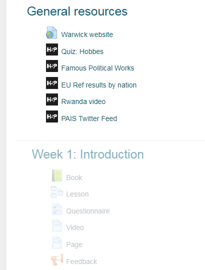
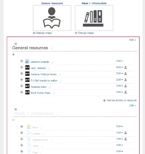
If you are using the topics format (i.e. all your topics/weeks have their resources listed down the page) it's fairly clear which sections are visible and which are hidden. You will clearly see that the hidden sections are greyed out, indicating that they are not visible to your students.

In the screenshot below, the 'General resources' section is visible, while the 'Week 1: Introduction' is hidden.

In this image, the

Collapsed topics format

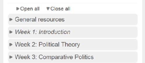
If you are using the 'collapsed topics' format, then it's not quite so obvious which sections are visible. If you take a look at the screenshot below, the only indication the 'Week 1: Introduction' is hidden is that it is written in italics.

Collapsed topics with the sections closed

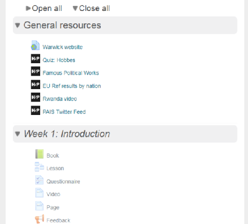
Things are slightly easier to see when the collapsed topics are expanded, because in addition to the title being in italics we can also see that the resources are greyed out, similar to the standard 'topics' format.

Collapsed topics with the topics open

Grid format

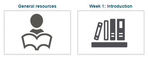
Things get slightly trickier when we are using the 'grid' format. Unfortunately, there is no discernible difference in visible/invisible topics when viewing your module landing page, as you can see below.

Grid format

In this example, 'Week 1' is actually still hidden to students, but you wouldn't know it! If you click on 'Week 1' you will be able to see that the resources are greyed out, but this is time-consuming if you have lots of sections.

The best way to check if all your sections are visible is to 'Turn editing on' (via the cog in the top-right), and then scroll down the page to the editing area, where you will clearly see which sections are greyed out.

Grid format with the editing on

Here we can more easily scan down the list of topics and see that 'Week 1' is in fact greyed out (invisible).

Change a section's visibility

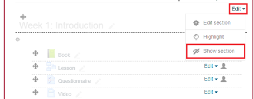
If we need to toggle a section's visibility, first we need to 'Turn editing on' for the page (via the cog icon in the top-right of the page). Then, alongside the section title we need to change, click the 'Edit' dropdown, and choose either 'Show section' or 'Hide section', as shown via the red highlights below.

Show section

Switch to student view

There is another, more reliable, method of checking your module page is displaying as intended, and that is by simulating a student view.

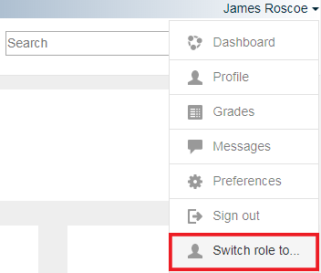
To do this, click the dropdown next to your name in the top-right, and then choose 'Switch role to...'.

Switch role to

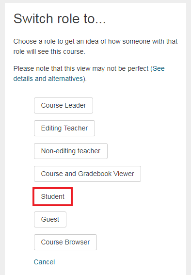
On the next screen, you can choose 'Student' from the list options. This will take you back to your module so that you can view it as if you were a student (rather than an editing teacher) and you will now clearly see which sections are visible. Any invisible sections or resources will simply not display at all!

Switch role to student

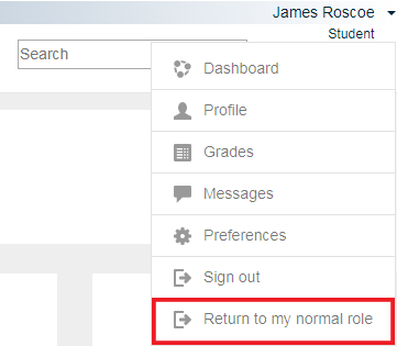
To exit student view and return to your normal role, simply click the dropdown next to your name again, and choose 'Return to my normal role', as shown below.

Return to my normal role

Any questions?

I hope this post will help you with checking your module page and ensure all the right sections are visible to your students.

If you have any queries or would like further support on your module page, please feel free to contact me.


November 2024

Mo Tu We Th Fr Sa Su
Oct |  Today  |
            1 2 3
4 5 6 7 8 9 10
11 12 13 14 15 16 17
18 19 20 21 22 23 24
25 26 27 28 29 30   

Search this blog

Tags

Galleries

Most recent comments

  • Yes really good to see a deep understanding of the needs of mobile users when accessing course conte… by Sally Hanford on this entry
  • Great work James! Brilliant design work, and well executed design methods. And a really useful artic… by Robert O'Toole on this entry

Blog archive

Loading…
RSS2.0 Atom
Not signed in
Sign in

Powered by BlogBuilder
© MMXXIV