All entries for Thursday 28 March 2019
March 28, 2019
Moodle Redesign Feedback Survey for PAIS: The Results
To follow up the work we did last year on improving the layout of our Moodle pages (based on student focus groups), we recently distributed a feedback survey to gauge the views of students now that they have had two full terms to work with the new layout. In this post we'll look at the results of that survey (full results of all responses are available as a download at the bottom of this article).
The survey was distributed to second-year undergraduate PAIS students in March 2019. Second year students were selected because (a) first-years would not have experienced the previous design as a point of comparison, and (b) there was a concern about 'over-surveying' finalists due to the NSS running at the same time. An entry into a prize draw for £50 Eating@Warwick credit was offered to anyone who took part. In total we had 36 responses out of approximately 200 students (~18% response rate).
How much do you agree with the following statements?
We started off by asking respondents to rate their level of agreement with the following statements (on a scale of strongly agree, agree, neutral, disagree, or strongly disagree):
- 'My PAIS modules are now presented more consistently'
- 'Structuring by weekly topics makes it easier to find what I'm looking for'
- 'Reading lists embedded week-by-week makes it easier to find material'
- 'It is now easier to find the contact details of teaching staff'
- 'It is now easier to view my PAIS Moodle modules on a mobile phone'
- 'The new Moodle layout is helpful for supporting my learning'
The results were as follows (click the graph to enlarge):
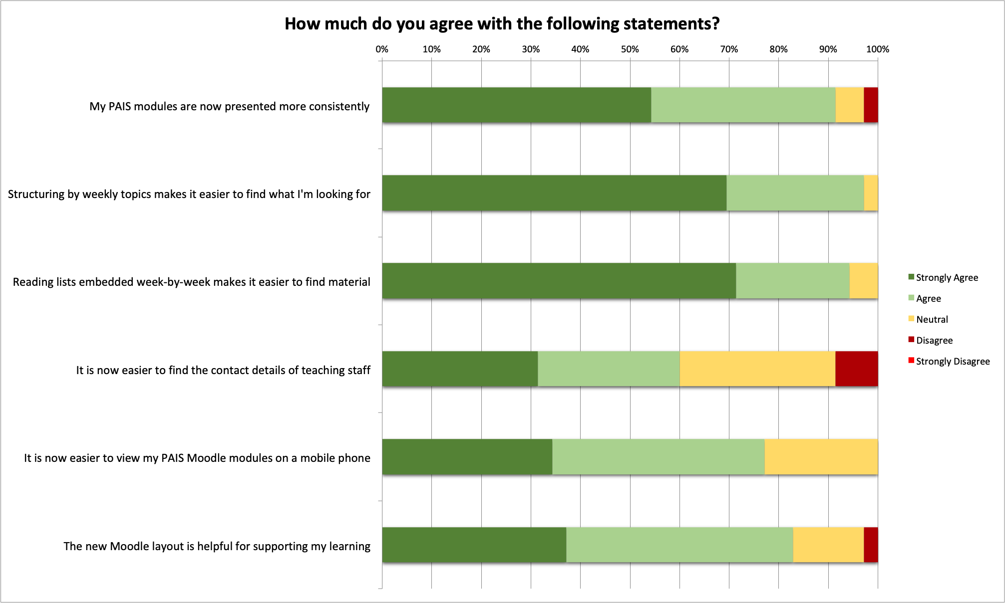
Somewhat reassuringly, the vast majority of the responses were very positive, in particular around consistency, ease of finding content, and the decision to embed reading from Talis Aspire by week.
There is some slight area for improvement on the question about accessing Moodle on a mobile (this now works much better than previous years, but we acknowledge there are still some outstanding issues), and in particular there were a several respondents who only answered 'neutral' or 'disagree' when it came to the ease of finding staff contact details. We are going to look at improving this for the next academic year (2019-20).
For the next three questions we enabled text-entry answers to get some qualitative comments.
What is your favourite thing about the new layout?
The word cloud below shows the most common responses to this question. For the purposes of producing a meaningful word cloud, the totals of certain words were combined when they had near-identical meaning, e.g. 'consistent' and 'consistency'. (Click the image to enlarge):
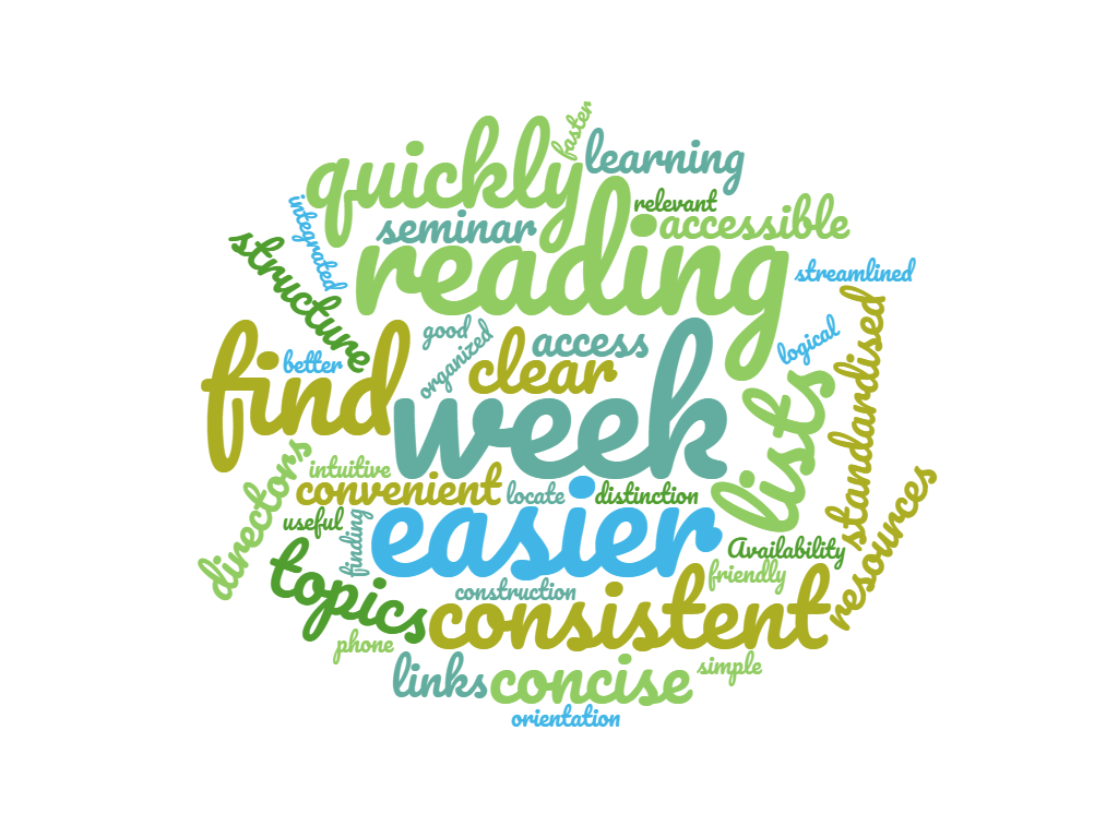
We can see from this word cloud that one of the main changes we made (organising the modules by weekly topics, with weekly reading lists embedded in each week) was a very popular decision, as the words week, topics, reading, and lists featured prominently as respondent's favourite feature.
We can also see that references to consistent and standardised are very prominent, which was one of the main goals of our redesign.
There are many positive adjectives that show just how much students like the new layout. These include easier, quickly, accessible, convenient, concise, useful, logical, simple, and intuitive. Seeing these words coming back from our users is hugely encouraging as these are clear indications that we have got our design right in terms of usability.
What could still be improved?
Similarly, I have produced a word cloud based on what students said should be improved. (Click the image to enlarge):
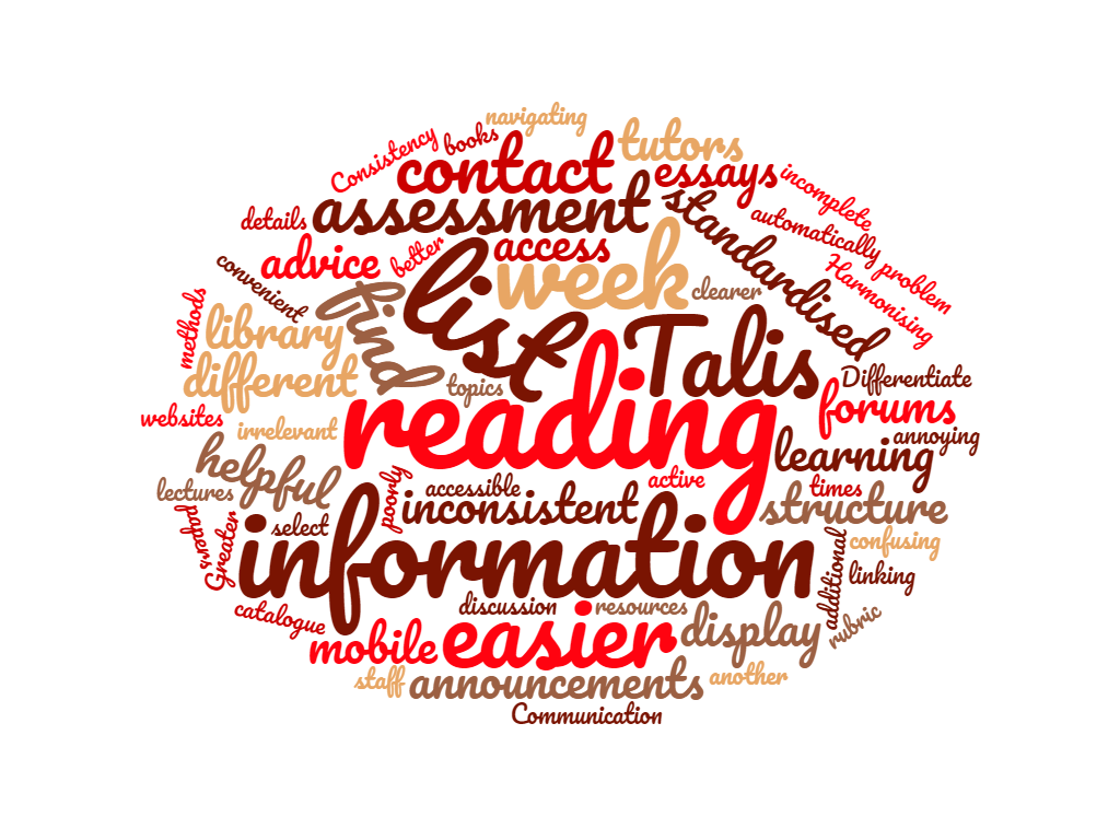
The picture here was perhaps less clear, with no single theme around what wasn't working well (potentially this could be interpreted as a good thing, because there is no obvious area in which we are failing students). There were lots of different ideas to sort through, including encouraging use of forums, providing clearer contact details, improving weekly descriptions, and better use of the announcements section. Indeed, the need for clearer contact details was flagged up by quite a few respondents, and while we have made big improvements in consistency in this area since last year, it's helpful to know that we could still do better here.
Two major themes did appear to be visible, however.
Firstly, as we have now set an expectation of consistency across modules (particularly around Talis Aspire week-by-week reading lists) students are critical of modules that don't uphold this consistency. This is why we see words such as Talis, reading, list and week appearing prominently, because there were certain modules that didn't conform to the use of Talis or the weekly reading setup that students now expect to see.
Secondly, the way we handle assessment could be improved, both in terms of the consistency in assessment information that we provide in Moodle, and in terms of integration with Tabula which we use for submissions. This explains the prominence of the words assessment, essays, Tabula, and rubric.
Any other comments?
We ended the survey with an opportunity for students to leave any further comments in a free text field. Of those that left comments, most were positive about the redesign, with some additional recommendations for improving consistency, wider use of Talis Aspire, and improving the information about assessment.
The full list of 'any other comments' is shown below:
"Showing this to other students from the Faculty, universal positive feedback was received. This has been something the PolSoc SSLC has supported from the beginning of the year, pitching this idea to other departments in the Faculty (not necessarily saying they should use the PAIS design) would ensure that joint degree students have at least relatively similar degrees of consistency if not just one single moodle experience."
"Both sets of Moodle pages have been easy to use and useful overall."
"The collection of Resources and General Info is really useful for just having one common space of misc stuff!"
"Thank you for putting effort into developing these platforms."
"I think having a Tails Aspire page (one that is regularly updated, of course) should be a requirement for all modules."
"Clearer information on Exams/Essays would be better than the huge blocks of text under the 'assessment' section on the new Moodles."
"There could be some more consistency between modules in the way they use moodle - in terms of the notes and seminar information they put up. Also, a general standard level for the amount of notes, and if not what is available on the lecture slides that is available. If someone misses a lecture due to illness, and it is not lecture captured, there needs to be notes on the lecture if there is very little on the slides (this is the case in my International Relations module)."
"A real improvement from last year!"
Conclusions and full results
Collecting this data was an extremely useful exercise, and we would like to thank all of the students who have now responded. We will be using the results to fine-tune some of the improvements to the modules, particularly around staff contact details, consistent use of reading lists, assessment information, and mobile responsiveness.
There were also many other helpful comments and suggestions that were submitted by individual students (unfortunately too many to respond to in this article) that we will be taking into account for the next academic year.
The winner of the prize draw has now been selected and has been informed directly.
You can download the full raw data from the survey here: pais-moodle-redesign-feedback-survey-march-2019-full-results.pdf.
Any queries about the survey or the PAIS Moodle redesign can be directed to James Roscoe, Academic Technologist for PAIS.
 James Roscoe
28 Mar 2019 15:07
|
James Roscoe
28 Mar 2019 15:07
| ![]() Tags: Feedback Moodle Pais Survey
|
Tags: Feedback Moodle Pais Survey
|  Comments (0)
|
Comments (0)
|  Report a problem
 Please wait - comments are loading
 Loading…