March 08, 2009
More AIR web automation – styles and dispatching mouse events
Follow-up to Automating web workflow in Adobe AIR from Transversality - Robert O'Toole
More experiments with creating automated workflows using the AIR html component. The following code gets the dom document once the html has loaded. It then gets a reference to a span in the document called 'edittool'. Once an element is referenced as a Flex Object, we can call native javascript methods on it. In this case, I give it a yellow dashed border. I then get hold of the A element that is it's child, and dispatch a mouse over event to it, causing its mouseover handler to be called. The result is that the edit menu appears.
private function initDomWindow(event:Event):void {
    this.domWindow = event.currentTarget.domWindow;
    var edittool:Object = domWindow.document.getElementById("edittool");
    edittool.style.borderColor = "yellow";
    edittool.style.borderStyle = "dashed";
    var overevent:Object = domWindow.document.createEvent("MouseEvents")
    overevent.initEvent("mouseover", true, true);
    var a:Object = edittool.getElementsByTagName('A')[0];
    a.dispatchEvent(overevent);
}

The html mxml tag is configured as:

<mx:HTML id="htmlTranslate" width="800" height="800" location="{this.url}" complete="initDomWindow(event)"/>
March 07, 2009
Green laning on an R100GS with Continental TKC80 tyres
Follow-up to Travel Report: using Metzeler Tourance tyres off–road from Transversality - Robert O'Toole
Last week my GS was serviced by the very good Behind Bars trail bike shop in Kenilworth. I also asked them to change the tyres. In the last few years I've had several sets of Metzeler Tourance tyres that have worn far too quickly. On a couple of occasions, lumps of rubber have actually peeled away from the carcass - once in the middle of a dash across France. The Continental TKC80 Twinduro tyres are now standard fitment on the R1200GS Adventurer, the modern equivalent of my R100GS Paris Dakar. They seem to be popular. If they are fine on a 105bhp modern bike with lightning fast brakes, they should be OK on my 65bhp airhead with almost no braking power.
Here's a photo of the GS with TKC80s:
Today I went for a test ride, on tarmac (not too fast until they run in) and along a green lane. As one would expect, they proved to be much better in the mud, with no sliding at all. However, surprisingly, they give better grip on the road as well. I suspect that is down to softer grippier rubber. They will last for only 3000 miles, much less than the Tourance.
Here's a close up of the front:
Compare that to a Tourance front, and you can see why they are like tractor tyres off-road:


March 06, 2009
Automating web workflow in Adobe AIR
This entry was created using an AIR based browser.
Yes, it's possible. I wrote a simple AIR app that signs me in to Warwick Blogs by loading the login page into an AIR app, populating the login form fields, and submitting. It's also possible to call javascript methods in the page. Here's the code:
<mx:WindowedApplication xmlns:mx="http://www.adobe.com/2006/mxml" layout="absolute" width="1024" height="768">
<mx:Script>
<![CDATA[
import mx.controls.Alert;
private var domWindow:Object;
private var blnAlertThrown:Boolean = false;
private var load:int = 0;
private function initDomWindow(event:Event):void {
if(load == 0)
{
load++;
domWindow = event.currentTarget.domWindow;
getElementFromHTML("userName").value = "myusername";
getElementFromHTML("password").value = "mypassword";
domWindow.document.forms[0].submit();
}
else
{
load++;
}
}
private function getElementFromHTML(elementName:String):Object {
var arrayContainingAllFoundElements:Object = domWindow.document.getElementsByName(elementName);
return arrayContainingAllFoundElements[0];
}
]]>
</mx:Script>
<mx:HTML id="htmlTranslate" x="10" y="84" location="http://blogs.warwick.ac.uk/blogbuilder/admin/create/plainEntry.spr?blog=094d4021fb4dbd6d00fb4de01b490001&newPermissions=Anyone&newCommentPermissions=Anyone" complete="initDomWindow(event)"/>
</mx:WindowedApplication>
March 04, 2009
Page template copy wizard for Sitebuilder
Problem: How to help a novice user to create a new page based on a template page. She then needs to be able to change the properties for the page (page title etc), and edit the resulting page. I don't want to simply automate the whole process, but do it in a series of steps so that she learns about the underlying process. A balance is needed between automation and transparency.
Solution: I could automate the whole process so that all she needs to do is complete a simple form and a program does all of the work. Sitebuilder APIs allow that. However, instead I created a wizard that presents each step in the Sitebuilder UI, along with a set of instructions. The Sitebuilder UI is embedded as an iframe (they do occasionaly have their uses). Some code in the container page does the work of forwarding the iframe on to the next step in the process, and displaying the correct set of instructions.
Here's a short movie demonstration:
Steve Carpenter suggests that this approach could be better employed in an AIR application.
February 27, 2009
Simple data driven dynamic functionality in a Sitebuilder page
Here's my problem:
I'm trying to help someone to create a series of Sitebuilder pages. Each page contains a list of questions and a podcast. The student listens to the podcast, thinks, clicks a button, and sees suggested answers revealed.
Some constraints:
Her IT skills are minimal. It could be done with questions and answers on separate pages, but that would require two template pages both of which would need to be copied, renamed and edited (I said 'minimal').
My solution:
I've created a single template page. I've added a "data area" to the bottom of the page, into which she can type each question and answer. The data area looks like this:
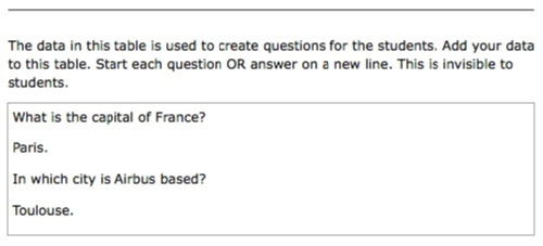
The data area is hidden from sudents using this code:
 [if-student] <script>
$('inlinedatatable').className = "hidedata";
</script> [/if-student]
But she can see and edit the data area in the Sitebuilder editor.
There's some javascript that runs when the page loads. It reads the data area, and adds two lists to the page, one visible (questions only) and one hidden (questions and answers). The student can click on an icon which causes them to swap over, so that the answers list is revealed.
Hidden:
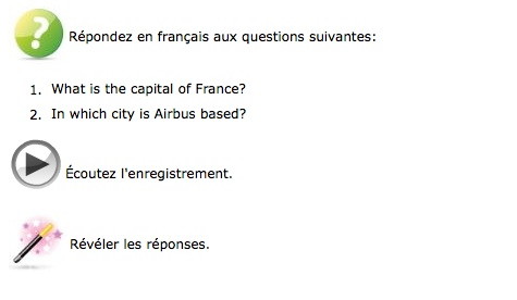
Revealed:
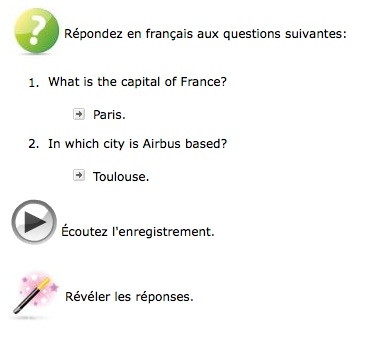
So I have a means for adding dynamic functionality, but which is editable by a novice user.
Data areas have potential. Better than having data stored separately in an xml file.
February 24, 2009
The Ikea effect – why we should build a flat–pack V[R]LE
For some time now my colleagues in the Warwick E-learning Advisor Team have been arguing that we should create some kind of 'templating' system within the web publishing component of our V[R]LE (Sitebuilder). Chris Coe has a great name for it: Elaborate (quick, file for a trademark).
The idea is that we could create templates based on generic and discipline specific learning designs. A template would embody the structure, functionality, and flow of the learning design in a set of pages and interactions. The template could then be copied and, following a set of instructions, filled-out with learning content. For example, there could be a template for a peer-review process. This could even be combined with a 'wizard' approach that builds the detail of the learning activity based upon answers provided by the learning designer (tutor) to a series of questions.
We justify this argument with these claims:
- Speed and efficiency;
- Promoting consistency and good practice;
- Developing a shared language for describing different learning designs;
- Giving a focus for evaluating different learning designs;
- Allowing us to tailor designs for departments and courses.
I've just discovered a further significant reason for working in this way, given in an article in the February 2009 edition of the Harvard Business Review:
The Ikea Effect: When Labor Leads to Love by Michael I. Norton of Duke University
...labor enhances affection for its results. When people construct products themselves, from bookshelves to Build-a-Bears, they come to overvalue their (often poorly made) creations.
The success of Ikea, they claim, is to some extent based upon the flat-pack principle - do much of the work for the customer, but allow them to feel as if they are still investing their labor (and hence their love) in the product. Perfect flat-pack makes people love you! And Ikea certainly do have some ingenious ways with flat-pack construction.
A templated learning-design is flat-pack.
Norton gives a warning: if the customer puts too much work into the construction, they may end up loving the product too much, thus making future change impossible.
The second rule of Ikea is to make the construction easy enough for the product to feel potentially disposable.
The same must be true of learning activities built from a template.
But what of customisation? We know that people love to customise. Indeed, Ikea offer that to some extent, but the customisation is never fundamental - it's simply a matter of combining products and adding ornaments (that's why they sell cheap bits and pieces from which they can't possibly profit).
So then, how to build a V[R]LE that is used and cherished by the masses: use the Ikea effect.
If you're involved in building learning content, or are interested in the construction of V[R]LEs, you are welcome to comment on this idea.
Update: I've just thought of another reason why templating is good. Here's the use case:
- Tutor A creates a useful template.
- Other tutors in their department see the pages created from the template, and want to do similarly.
- Each page is marked with "Created using the template TEMPLATE NAME, designed by PERSONS NAME .
- The tutors can then create their own pages using the template, and get advice Tutor A.
February 23, 2009
How to Pitch a Brilliant Idea by Kimberly D. Elsbach
Writing about web page http://hbr.harvardbusiness.org/2003/09/how-to-pitch-a-brilliant-idea/ar/1
A summary of the first paper read and discussed by the Warwick University Harvard Business Review reading group.
The article is based upon a “lengthy study of the $50 billion U.S. film and television industry” by the author, a business in which “making a pitch” is a standard practice. It seems that “pitching” and “catching” are core business processes, occurring within structured and often repeated events. Meetings are often held in which a series of pitches are presented to a group of catchers with decisive power.
The members of the reading group identified similarities and differences when compared to the university environment. Opportunities to make a pitch to an audience with decisive power being almost completely missing. Whereas in the T.V. industry the 30 minute pitch is a standard practice, in the university we use written submissions that are shoe-horned into forms (or the occasional lucky “elevator pitch”). Visual presentations and demonstrations, which could be essential, are impossible. We agreed that the university could benefit from the adoption of “pitching” and “catching” – perhaps with training made available (talk to LDC).
Elsbach also investigated other industries, to see if the same processes and rules occur – including all kinds of business involving product design, marketing and venture capital. She concludes that the same principles apply.
The reading group agreed that making a pitch is an essential career skill. We noted that the Careers Centre recently ran a session for students called “Pitch Idol”. We agreed that similar sessions would be of use to many other students and staff.
We also noted that “pitching” and “catching” is an essential part of teaching practice.
Elsbach’s most important finding was that the tendency of “catchers” to be influenced by simple stereotypes results in many pitches for good ideas failing. The question: “why is U.S. T.V. so bad?” is answered with: because the pitching-catching process is failing. She found that “catchers” very quickly classify a “pitcher” into one of three types – and that “pitchers” commonly play into these types. The types are:
The Showrunner – a combination of charisma and wit with apparent technical mastery – highly skilled at drawing the catchers into an idea and manipulating them: “create a level playing field by engaging the catcher in a kind of knowledge duet”. Only 20% of successful pitchers were said to be showrunners.
The group agreed that ‘pitching opportunities’ at Warwick tend to be dominated by a small group of skilled showrunners, and that this could lead be a limit upon innovation and growth. It might also be the case that showrunners have become catchers, and as such jealously guard there control over the show. Do good showrunners make bad catchers?
The Artist – “He wore black leather pants and a town T-shirt, several earrings in each ear, and a tattoo on his slender arm. His hair was rumpled, his expression was brooding.” That’s an extreme characterisation. A hint of non-conformism can do the same trick: creativity is rare, and hence ideas coming from creatives can seem more valuable than they really are. 40% of successful pitches came from this type. One particularly valuable aspect of the ‘artist’ is their tendency to use whatever method is necessary to express their idea, regardless of rules – for example, organising a practical session to get everyone involved.
Lots of these at Warwick, but they struggle to get opportunities to express themselves. The CAPITAL centre are a notable exception.
The Neophyte – “…the opposite of showrunners. Instead of displaying their expertise, they plead ignorance.” – seeming to only have a casual interest in the pitched idea, they distance themselves and invite criticism. This is a risky strategy. The idea might get accepted. The criticism might be positive. Or more probably it will get completely trashed.
When dominant showrunners become catchers, do encourage only neophytes to pitch? How often are neophyte ideas later recycled by showrunners?
Elsbach’s paper gives two principal messages of advice:
To pitchers – watch out for the stereotypes, take the best from each of these approaches, build a reputation for great ideas and great results.
To catchers – watch out for your own tendency to stereotype, focus on the idea, help the pitcher to express their idea.
But we could also add to this a lesson for businesses:
If you want to be genuinely innovative and creative, and you want to keep agile and competing, set up an environment that supports effective pitching and catching.
The group concluded with some thoughts upon how we could use training and new technologies to help people to become better pitchers – for example, creating videos to use in their pitching.
If you've read the article, and have a useful comment, you are welcome to leave it below.
Join the Warwick Harvard Business Review reading group on Facebook, or contact r.b.o-toole@warwick.ac.uk
February 13, 2009
Video debate production – Xacti's, iMovie09, audio restoration with SoundSoap
The Arts E-Squad (me, Nikesh and Douglas) recently recorded a debate on historiography. The final edit is now online.
We used 3 cameras (3 Sanyo Xacti's). One camera was tripod mounted and pointed at the panel. The other 2 cameras were hand-held and took footage of the audience and close-ups of the panel. Sound was recorded onto an MP3 recorder.
The video footage was quite good. However, the room (H042) has loud air conditioning, and is also next to an area where students gather and are noisy. I had to clean up the audio, using the Sound Soap tool. This has eliminated the air-con noise, and allowed me to increase the volume, but has a slightly "underwater" effect.
The video and audio was edited using the new Apple iMovie09. At the start there is a nice animated title, and a jingle from the iLife 09 stock audio. I added "cutaway" shots (now easy in iMovie) using the footage from the two hand-held cameras. I was able to sync close-ups of panellists with the main footage, as well as a shot of a student asking a question. I also sprinkled shots of the audience liberally throughout. Image stabilisation was applied to the hand-held footage - very effective.
February 02, 2009
Media Workshop Experience January 2009
On Wednesday January 21st we held the first Media Workshop Experience event for students.
This was a collaboration between the Careers Service (James Mears and Stephanie Redding), Arts E-learning, the Arts E-Squad (Nikesh Parmar, Catherine and Pesala Bandara), and Tracy Playle of PickleJar Communications.
We had various aims. James and Stephanie are looking for new ways to give students simple but meaningful experiences that might help to seed an interest in media careers. I am looking to develop the idea that students, with relatively little training, can create good short movies that might be of use to their departments, the university, and as part of their own personal development. I am also establishing interest in an ambitious project that aims to get people at Warwick to create videos: the Warwick Media Workshop (join the Facebook group).
The event took place in the Teaching Grid. We began with a short talk and a demo movie (see below) illustrating what is possible in just a short time using the available equipment (iMacs, Screenflow, iMovie, Sanyo Xacti SD card based cameras). Tracy then gave 15 minutes of advice and tips (very good). The students split into four groups, each with a camera and iMac. Two of the groups had already formed from a shared interest (there was a group from the Arts Centre Stars programme). The other groups were mostly strangers, and hence faced the additional tasks of integrating into teams, and coming up with an IDEA. The groups then developed their IDEA, using techniques (including storyboarding in Powerpoint).
We noted that they spent much longer than expected in developing their ideas, and didn't really get a good sense of feasibility (must look into ways to get them to be more realistic). This meant that none of the teams completed within the three hours, and two of the teams carried on for an extra hour. All of the teams, however, had good movies in the edit stage, and we were able to watch and enjoy their draft edits. The level of creativity was quite surprising. Tracy had advised them, as a means to spark ideas, to find simple props - one team based their movie around a food tray (boxing ring), an apple (boxer representing healthy food) and a hamburger (boxer representing junk food). The teams have been invited to complete their movies in their own time.
As a venue, the Teaching Grid worked well. However, noise was a problem as each group performed scripted material. Having to move 4 iMacs into the Grid, and then return them to the office was far too difficult. This will be easier next time, as the Media Workshop project has based an additional iMac in the Grid.
Here's the demo video, illustrating some of the possibilities...
iMovie 09
We've just got the latest version of Apple's iLife09 creativity suite for the Media Workshop and Arts E-Squad iMacs. iMovie is particularly impressive.
Here's a movie I created to try out some of the new features. It was filmed using a Xacti HD camera.
The movie was edited using iMovie09, and features several of the new features including: animated titles, picture-in-picture (notice the drop-shadow), cut-aways (can use for multiple camera work), ripple transition. Other new features not used include: adjust the speed of a clip, separate the audio from a clip, overlay clips with transparency. The music is from the free iMovie09 stock.
December 28, 2008
WiMIC Browser v.3 – MySQL, BlazeDS, Lucene, Spring, Flex 3.0, Cairngorm
Follow-up to WiMIC Browser v.2 – migrated to Adobe Flex Cairngorm application framework from Transversality - Robert O'Toole
I've taken advantage of some new technologies to redevelop the Women in Modern Irish Culture data browser. The application will eventually give full online access to a big biographical and bibliographical database developed by researchers at Warwick and University College Dublin. The last version was rather over-complicated and ponderous, giving slow and awkward access to the data. This new version provides a much more instantaneous view onto the thousands of records. It is now really a data browser rather than just a search tool. Researchers can immediately scan through thousands of records, which are all immediately loaded into data grids. Whereas the old version served up 12 records at a time as a result of database queries via JSON, the new version can serve up over 9000 records in a few seconds, using the highly efficient BlazeDS mechanism.
Rapid data browsing with BlazeDS
This is how it works:
- the Flex/Flash interface calls a method on a Remote Object that will return an ArrayCollection of Author objects;
- the RemoteObject proxies through to a corresponding method in a class exposed via BlazeDS;
- the Java method is in fact a Spring bean which queries the database using Spring's jdbc utils (the data is now on MySQL rather than SQL Server);
- Spring builds a Flash Remoting ArrayCollection of Author objects (corresponding to my Flex Author class);
- the ArrayCollection is returned as the result of the proxied method using the effiiciently compressed AMF protocol;
- the ArrayCollection is added to the Flex Cairngorm model, to which the datagrid is bound;
- the data appears in the grid, and can be browsed and re-ordered instantly.
Even when retrieving all 9000+ authors, that only takes a few seconds.
The authors are listed in an AdvancedDataGrid, allowing the researcher to drill down into a selected record. This retrieves further data about the selected author (using BlazeDS) including a list of publications.
Fast and smart querying with Lucene
In addition, I have used the Lucene Java library to add query interfaces that search pre-built indexes. Lucene performs free-text and exact searching as required, and also uses synonyms. So, for example, a researcher could search for "Dublin AND poetry" in the simple search form, and see almost instantly all authors with the words "Dublin" AND "poetry" in their records (including their publications). It would also list records containing "poem" and "poems", giving them a lower ranking in the results.
To be even more precise, one can search for "Locations:Dublin AND Genres:poetry" which would return only authors of poetry with some association with Dublin. "Locations" and "Genres" being fields in the Lucene index. I'm using that mechanism to create a search interface with specific fields such as "genre", "surname", "firstname", "publication title" and "location".
As with other queries, BlazeDS is used for highly efficient transmission of results.
A further addition, again using BlazeDS and Lucene, is the ability to list authors who had published in a selected decade. Each author record in the Lucene index contains a list of the decades in which they published. The efficiency of this approach is demonstrated by viewing all authors to have published since 2000.
Now that I have all of these elements in place, I'll be able to quickly add more features and richer data, including more information on publications.
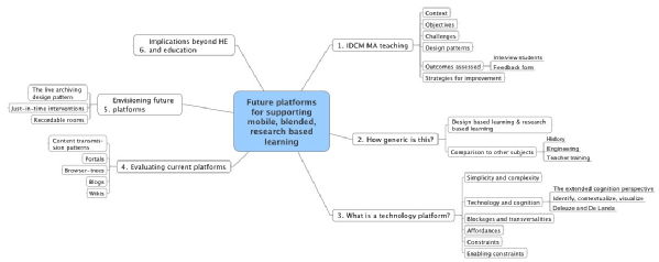
Project plan: future platforms for mobile, blended, research based learning
Follow-up to Abstract for a presentation on future development in support of mobile research based learners from Transversality - Robert O'Toole
IDCM MA is the International Design and Communication MA on which I have been teaching, and which has given me opportunities to try new teaching techniques. It is also the driver behind many of my new ideas.
Click to enlarge...
December 12, 2008
Video podcast seminar presentations with Videocue and Screenflow
At the Warwick Network Day event yesterday, Chris Coe and I taught a workshop that, amongst other things, demonstrated the kind of video presentations that the E-Squad do with Screenflow. We got the participants to choose a series of web pages, and then to write a short script. Screenflow recorded them reading the script, while moving around the web pages. With the big Apple 24" screens, we could have the browser on the left and the script on the right. When edited, this produced a video presentation about the web pages, with a "talking head" style inset.
The scripted approach works well. Apart from the obvious advantages, it offers the additional pedagogical benefit of encouraging participants to develop the presentation as a structure. And therein lies something of value to be exploited in teaching. How about if students were to develop their seminar presentations in this way? Not only would it help nervous students, and those with little experience of doing presentations, it would also improve the structure of presentations. I've already had discussions with teachers, and we have plans to try this out next term.
There is, however, one useful feature that is missing in Screenflow: an autocue. And so I had a look for such software that I might be able use. One such tool is in fact made by the same people as Screenflow. However, it goes further, overlapping in functionality with Screenflow.
Videocue plays a script at a selected speed, and records input from one or more sources. In the screen grab below, you can see the script, and to the right of the script is a timeline onto which the required sources are placed. So in this case, it starts with the video from the iSight camera on the Mac, then shows a photo, before moving back to the iSight. Further sources could be used, including other cameras (meaning that it would be possible to structure an interview or discussion) and video files (for example, sequences from Screenflow). When the record button is pressed, the script is read through with the appropriate source combined into a .mov movie.

There are also options for transitions and chroma key (for example, use a green screen to make it look like you are in Pompeii).
I'm going to trial this with some students.
It will publish to a blog or as a podcast. If I could get it to post directly into Sitebuilder and Warwick Blogs, that would be excellent. An AIR version would be even better.


 Robert O'Toole

 Please wait - comments are loading
