Design for a VLE interface linking lectures, seminars, readings, research based learning
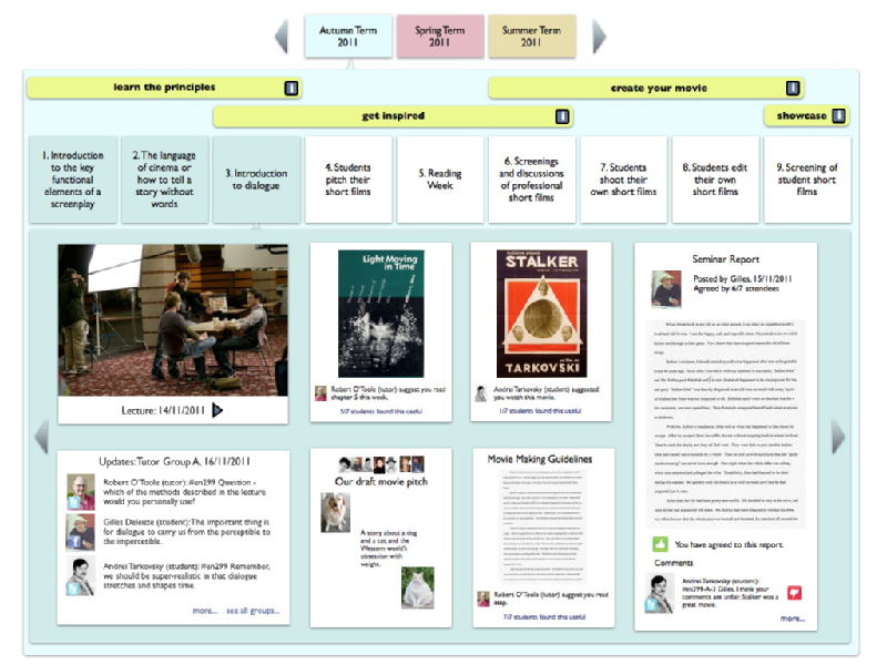
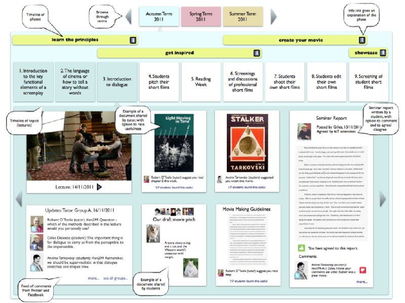
An idea for an interface that presents typical Warwick undergraduate module structures, activities and events in an intuitive manner. The design aims to visually illustrate how the conceptual and practical outcomes of the module are mapped into the organisation of the module. The user is able to skim through terms, phases, weeks (topics) and resources with an iPhone/iPad style horizontal movement. Students are able to upload recommendations (links) and files into the large panel that contains materials relevant to each week/topic/lecture.
There is a higher quality PDF version for download. Or you can see plain and annotated images below:

And an annotated version:

 Robert O'Toole


Jonathan Baldwin
I really like the concept – I’ve used timeline approaches myself (like the top three rows) but having all the documents and links laid out like that is really handy.
Mmm… it’s given me some ideas
Apart from anything else this diagram really shows why Blackboard (and other systems) don’t work…
06 Jan 2011, 09:14
Mick
Make sure all course content is transportable. Don’t get locked into one piece of software, many have. An expensive regret.
14 Jan 2011, 13:42
Comment awaiting approval
This comment is awaiting approval by the author of the entry.
14 Mar 2011, 12:38
Add a comment
You are not allowed to comment on this entry as it has restricted commenting permissions.