Showcase poster design for e–learning exhibitions
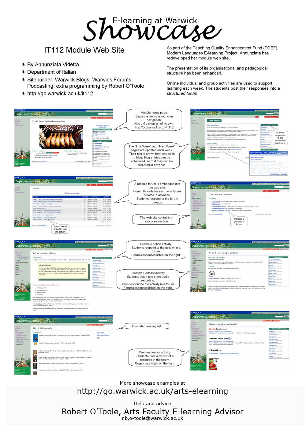
Each poster demonstrates an example of the effective use of technology in teaching, learning and research. It has four elements:
- A series of statements about what it demonstates, who did the work, what technologies and techniques it employed, along with a url to the showcased work.
- A few short paragraphs of text (100 words maximum) explaining the rationale behind the showcase.
- A series of annotated screenshots or photographs demonstrating and explaining what has been done (a maximum of 8 on an A2 poster).
- A footer containing a link to the Arts E-learning web site and details of the E-learning Advisor.
The posters are printed to A2 (we have a colour A2 printer). My method for producing them is slightly odd. I first create each text element or image within a Powerpoint presentation, and then copy them into a Photoshop file (set to A2 size). I end up with a poster and a Powerpoint show for each showcase.
Here’s a good example:

If that’s too blurry on your screen, have a look at this it112_poster_small.pdf
For the next series of posters I am going to try to include more information about the processes and support infrastructure used to meet the stated objectives of each showcase.
 Robert O'Toole

Add a comment
You are not allowed to comment on this entry as it has restricted commenting permissions.