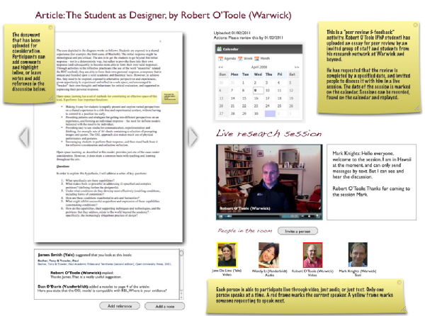
Design for online peer review and feedback
I have been investigating the operation of peer review and feedback. After discussing the process with a professor and a research student in History, I have sketched out this design. It is also applicable to research based learning activities and the development of academic writing at all HE levels (from undergraduate to professional academic research). Important considerations are:
- Simplicity (we need to engage people who have very little time for training).
- Access for video, audio and just text based users.
- International, inter-institution operation (the particular case in question has users at Vanderbildt and Yale).
- Put the author in control - they set the peer review process rolling, invite participants and set up live events.
- Connection to online libraries of references (the researchers have in mind integration with an online collaborative reference database).
- The ability to record and replay discussions.
- Ability to annotate (but not co-edit) documents.
- Threaded notes.
- A calendar, on which live events can be scheduled, and stages in the review process marked.
Similar use cases exist across the arts, humanities and social studies research communities (as well as in academic skills and creative writing), with interesting variations. For example, the author may wish to follow up the initial review by writing a new version of the document and uploading it for further, linked review. In some cases, they may wish to review more than one article at a time. In a similar way, they may wish to collectively review primary source articles from, for example, Early English Books Online (EEBO), which are available in PDF format.
Here is a sketch (click to enlarge). The large yellow post-its explain the design:

 Robert O'Toole


David Beck
Fantastic Rob, thanks for getting to this so quickly and the basic design is exactly as you outlined when we met- looks great. As to comments-
Firstly: screen size. I’m on my laptop at the moment and would be unable to fit, in legible size, the whole picture on my screen. A suggestion, rather than forcing users to scroll, might be to make the panes collapsible. That shouldn’t add much to the complexity of the set-up but would mean those with small screens (like Mark in Hawaii) could switch between the document and ‘chat’ or e.g. collapse the video & calendar so the rest fit on the screen.
Secondly: how does the chat work? You imply people ‘request to speak’- is that an automated system you are familiar with, or would it add a potential technophobe-problems?
Thirdly: the ‘static’ feedback area below the document would probably not suffice for more detailed feedback which would certainly be given in a “grad forum” type discussion… Would it be possible to have the “panes” switch so that when there is not a live event in progress the feedback area is on the right?
01 Feb 2011, 10:52
Robert O'Toole
Will (Theatre Studies) like this. He suggests looking at ISSU as a potential way to do the PDFs and commenting.
11 Feb 2011, 11:58
Add a comment
You are not allowed to comment on this entry as it has restricted commenting permissions.