All entries for Friday 17 April 2015
April 17, 2015
Presenting irregular datasets
Writing about web page http://bbashakespeare.warwick.ac.uk
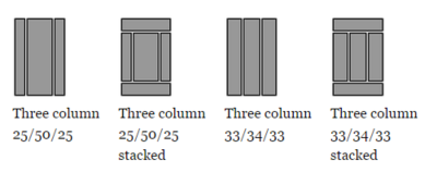
Most content management systems use some kind of administrator defined templating system, either site-wide or per page. Most often or not, this takes the form  of a grid arrangement. In deciding what template would be appropriate, you would look at the nature of data the page is to display, and an appropriate layout. This works fine with regular pages and datsets, but has become a recurring issue with datasets we've encountered in the digital humanities.
Humanities datasets are often sparse in parts, but have clusters or hotspots of data, often driven by data availability or the research process that identifies data of interest that deserves more granular capture into the dataset that would be time consuming and wasteful to do across the whole area of interest. Conforming data like this into a template means that one page can return a single result and the next, 30 or more. A classic "one size doesn't fit all" problem.
In the British Black and Asian Shakespeare, this very phenomenon occurs as the subjects of the database may feature actors with just a single performance - Stephen Beresford is director to just a single production of Twelfth Night in 2004, whereas Robert Mountford has seventeen seperate performances of interest in the dataset to his name. The default route to handle this variety is to use pagination, where at the bottom of the first page, you see how many unshown pages of results are tucked neatly behind a series of links. This technique sets a maximum reasonable number of records to display on a single page and a way of accessing any that spill over. I've become increasingly unsatisfied with this approach that comes at the loss of an overview. This project presented us with an opportunity to explore a different approach.
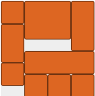
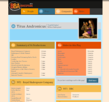
Inspiration was drawn from the Google Material Design philosophy, and a plugin was sought to enable layouts that were difficult to achieve with standard grid frameworks.  Masonry turned out to be just the javascript plugin needed to help us maximise the use of space dynamically with columns, irregular sized content and responsive design to different device's screen sizes. You can see that this two-column layout maximises the space on the screen, and each block of content takes up as much space as it needs, without impacting the other column. This is the key feature of Masonry, as it removes a fundamental restriction of HTML that prevents such layouts with dynamic content. What it does mean, is that the user is expected to scroll if there is a large dataset to be displayed, but this is not the concern that it used to be with an 'above the fold' mindset.
This is a step in the direction of more intelligent page design and depending on user response, a route we will look to employ on future projects.
Interestingly, commercial offerings are looking to bring more AI to bear on these problems. Notably thegrid.io is making a stir, with websites that design themselves around the content submitted to them. This is an approach we're tracking with interest as surely content determining layout rather than the other way around is the sensible way to design websites.
Special thanks to our project developer and the designer for the British Black and Asian Shakespeare project, Hafiz Hanif.


 Steve Ranford

 Please wait - comments are loading
 Loading…